NIFTY Option Chain Analysis: Complete Beginner's Guide (2026)
Team MarketNetra
6 April 2026
You've heard it a hundred times in trading groups: "Check the option chain." You open the NSE website, navigate to Market Data, click Option Chain, select NIFTY — and a wall of numbers stares back at you. Forty-plus rows, a dozen columns, calls on the left, puts on the right, strike prices down the middle, and data updating every few seconds.
You close the tab.
You're not alone. The NIFTY option chain is the single most powerful free tool available to Indian traders — and also the most intimidating one. SEBI data shows that 91% of individual F&O traders lost money in FY24-25. A significant part of this is that most retail traders either skip option chain analysis entirely or read it incorrectly.
This guide changes that. We'll start from absolute zero and build your understanding step by step — no jargon without explanation, no assumptions about what you already know.
What Is the NIFTY Option Chain?
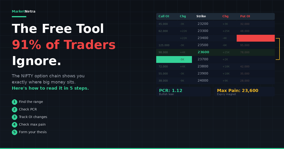
The option chain is a table that shows every available options contract for NIFTY across all strike prices for a given expiry date. Think of it as a live battlefield map showing where every trader — institutional and retail — has placed their bets.
The layout is consistent everywhere, whether you're reading it on NSE's website, your broker's platform, or a third-party tool. Calls (CE) are on the left side. Puts (PE) are on the right side. Strike prices run vertically down the centre column, typically in 50-point intervals for NIFTY (23,000, 23,050, 23,100, and so on).
For each strike price, you see data for both the call option and the put option at that level. The most important data columns — and the only ones you need to focus on as a beginner — are Open Interest (OI), Change in OI, Volume, and LTP (Last Traded Price).
Let's break each one down.
The Four Columns That Matter
Open Interest (OI): Where the Money Is
Open Interest is the total number of active contracts at a specific strike price that haven't been squared off or expired. It's the single most important column on the option chain.
Here's the key insight that changes how you read the entire chain: in Indian markets, option sellers (writers) dominate the OI figures. These are typically institutions, proprietary trading desks, and experienced traders with deep pockets. When you see 2 lakh OI at the 24,000 Call strike, it overwhelmingly represents large traders who have sold those calls — betting that NIFTY will not cross 24,000.
This leads to the fundamental rule of option chain reading. The strike with the highest Call OI acts as resistance. The sellers at that strike will defend it aggressively — if NIFTY approaches that level, they hedge by selling futures, creating natural selling pressure. The strike with the highest Put OI acts as support. Put sellers at that level have bet that NIFTY will stay above it, and they'll defend it by buying futures if price threatens to break below.
For example, if you open the NIFTY option chain and see the highest Call OI at 24,000 CE (say, 1.8 lakh contracts) and the highest Put OI at 23,500 PE (say, 2.1 lakh contracts), your expected range for the session or the week is 23,500 to 24,000. These aren't guaranteed walls — they break. But research suggests these OI-derived support and resistance levels hold approximately 70–80% of the time under normal market conditions.
Change in OI: Where the Money Is Moving Right Now
Static OI tells you where positions exist. Change in OI tells you where positions are being built or removed today. This is more actionable for live trading.
When you see OI increasing at a specific strike, it means new contracts are being opened — fresh money is entering at that level. When OI decreases, existing positions are being closed (unwinding). Fresh OI buildup at a strike strengthens it as support or resistance. OI unwinding at a strike weakens it.
This is where the famous six OI patterns come from, and every serious F&O trader should memorise them.
Long Buildup — Price rises + OI rises. Buyers are entering fresh long positions. This is bullish with conviction. New money is backing the upmove.
Short Buildup — Price falls + OI rises. Sellers are entering fresh short positions. This is bearish with conviction. New money is backing the downmove.
Short Covering — Price rises + OI falls. Previous short sellers are closing their positions (buying back). The rally is driven by shorts exiting, not fresh buying. These moves can be sharp but may lack follow-through.
Long Unwinding — Price falls + OI falls. Previous long holders are exiting their positions (selling). The decline is driven by longs giving up, not fresh selling. This often signals exhaustion of a trend.
Short Buildup at Call Strikes — If you see Call OI increasing while NIFTY falls or stays flat, call writers are aggressively selling. This builds resistance at that strike. The more OI accumulates, the stronger the resistance.
Put Writing at Put Strikes — If Put OI increases while NIFTY rises or stays flat, put writers are selling puts — a bullish signal. They're betting NIFTY won't fall below that level. This builds support.
Volume: Today's Activity
Volume shows how many contracts traded at a specific strike during the current session. High volume confirms that a strike is actively traded and liquid. Low volume means thin interest.
The critical combined reading: high volume with rising OI means genuine new interest at that strike. High volume with falling OI means positions are being squared off. Low volume despite high OI means dormant positions — they're sitting there but not being actively traded today.
LTP and IV: Price and Fear
LTP (Last Traded Price) shows the current premium of the option. As a beginner, you won't trade directly off this, but it helps you understand how much an option costs.
Implied Volatility (IV) is listed for each strike on most platforms. Think of IV as the market's fear gauge. Higher IV means traders expect bigger moves — options become expensive. Lower IV means calm expectations — options are cheaper. During events like budget day, RBI policy decisions, or election results, IV spikes dramatically. High IV means you're paying more for options as a buyer (bad for buying) but collecting more premium as a seller (good for selling).
Put-Call Ratio (PCR): The Market's Mood
PCR is calculated by dividing total Put OI by total Call OI. It's the single most-watched sentiment indicator derived from the option chain.
PCR = Total Put OI ÷ Total Call OI
The interpretation requires context. PCR above 1.0 means more puts than calls are outstanding. This might seem bearish (more people betting on a fall), but in reality, most put OI comes from put sellers — who are bullish. They've sold puts betting the market stays above those levels. So paradoxically, a rising PCR often signals bullish sentiment.
Here are the practical thresholds that experienced NIFTY traders use:
- PCR above 1.2–1.3 — Bullish lean. Significant put writing suggests institutions expect support to hold.
- PCR below 0.7–0.8 — Bearish lean. Heavy call writing relative to put writing suggests resistance holds.
- PCR between 0.8 and 1.2 — Neutral. No strong directional bias from institutional positioning.
- Extreme PCR above 1.5 or below 0.5 — Often precedes reversals. Markets tend to mean-revert from extreme positioning.
Track PCR changes during the day, not just the absolute number. A PCR rising from 0.9 to 1.2 during a session means put writing is accelerating — that's more informative than the static end-of-day figure.
Max Pain: Where Option Writers Want NIFTY to Expire
Max pain is the strike price at which the total payout to all option buyers is minimised — in other words, the price where the maximum number of options expire worthless and option writers collectively lose the least money.
Since option writers are typically the bigger, better-capitalised players in the market, NIFTY has a tendency to gravitate toward max pain as expiry approaches. This tendency is strongest in the final two days before weekly expiry (Thursday).
Max pain is not a prediction — it's a reference point. It works best when combined with OI levels and PCR. If max pain is at 23,800, current NIFTY is at 23,650, and put OI at 23,600 is strong, there's a reasonable probability of a drift upward toward 23,800 as expiry approaches. If max pain is at 23,800 but NIFTY is at 24,200 with heavy call writing at 24,000, the gravitational pull of max pain suggests limited upside and potential pullback.
Most broker platforms and third-party tools calculate max pain automatically. You don't need to compute it manually.
Putting It All Together: A Step-by-Step Reading
Here's how to read the NIFTY option chain in practice, from opening the page to forming a view.
Step 1: Identify the range. Find the strike with the highest Call OI (resistance) and the highest Put OI (support). This gives you the expected range. Write these two numbers down.
Step 2: Check the PCR. Calculate or note the PCR. Is it above 1.2 (bullish lean), below 0.7 (bearish lean), or neutral? This gives you directional bias within the range.
Step 3: Look at Change in OI. Are call writers adding OI at resistance (strengthening it) or unwinding (weakening it)? Are put writers adding OI at support (strengthening it) or unwinding? OI additions strengthen levels. OI unwinding weakens them.
Step 4: Check max pain. Where is max pain relative to current NIFTY price? If it's above current price with bullish PCR, the bias is up. If it's below with bearish PCR, the bias is down.
Step 5: Form your thesis. "NIFTY is likely to trade between [put OI support] and [call OI resistance], with a [bullish/bearish/neutral] lean based on PCR. Max pain at [level] suggests [direction] drift as expiry approaches."
That's it. Five steps. This entire analysis takes 2–3 minutes once you're familiar with the layout — or 10 seconds if you ask an AI intelligence tool to synthesise it for you.
The Five Mistakes Beginners Make
Mistake 1: Looking at only one column. Checking OI without looking at change in OI, or reading PCR without checking where the OI is concentrated. The option chain is a multi-dimensional picture — single data points mislead.
Mistake 2: Treating OI levels as exact prices. Heavy put OI at 23,500 doesn't mean NIFTY will bounce at exactly 23,500.00. These are zones, not lines. Allow 30–50 points of flexibility around high-OI strikes.
Mistake 3: Ignoring expiry proximity. OI-derived levels become more significant as expiry approaches and less reliable far from expiry. A reading on Monday for a Thursday expiry is directional context, not a precise trade setup.
Mistake 4: Fighting high-OI levels. If the option chain shows massive call OI at 24,000 and you're buying calls at 24,100 hoping for a breakout, you're fighting the heaviest-capitalised players in the market. Respect the walls until they clearly crack (OI unwinding + price pushing through with volume).
Mistake 5: Using the option chain alone. OI data is one piece of the puzzle. Combine it with FII/DII activity, India VIX, technical chart structure, and sector performance. The traders who synthesise multiple data sources consistently outperform those who rely on any single one.
How AI Changes Option Chain Analysis
Traditional option chain reading — scanning 40+ strikes, tracking OI changes, calculating PCR, cross-referencing with FII data — takes 10–15 minutes for an experienced trader. For a beginner, it takes longer and produces less reliable conclusions because you're still learning what matters and what's noise.
AI trading intelligence tools compress this entire process into a single question. You ask "Where are the OI walls for NIFTY this week?" and get the support, resistance, PCR, max pain, and any unusual OI activity synthesised in 10 seconds. More importantly, AI can cross-reference the option chain with FII/DII flows, India VIX, and technical levels simultaneously — something that takes even experienced traders multiple tabs and minutes of mental synthesis.
This doesn't mean you should skip learning to read the option chain yourself. Understanding what the data means is essential. But once you understand the concepts, AI eliminates the bottleneck of processing speed — letting you make decisions based on the full picture instead of whatever subset you managed to check before the setup moved.
Your First Week: A Practice Plan
Day 1–2: Open the NIFTY option chain on NSE's website at 9:00 AM. Identify the strike with the highest Call OI and the highest Put OI. Write them down. Check whether NIFTY stayed within this range by 3:30 PM. Do nothing else.
Day 3–4: Add PCR to your morning check. Note whether PCR is above 1.0 or below 1.0 at market open. By end of day, check if NIFTY moved in the direction the PCR suggested. Still no trading.
Day 5: Track Change in OI during the day. Check at 9:30 AM, 12:00 PM, and 2:30 PM. Note which strikes are gaining OI and which are losing it. See if the support/resistance range shifted during the day.
Week 2 onwards: Start combining option chain analysis with your chart. Mark the OI-derived support and resistance on your TradingView or broker chart. Notice how often price reacts at these levels. This visual confirmation will build your conviction in the data.
After two weeks of daily observation — without risking a single rupee — you'll read the option chain faster than 90% of retail traders. That's not an exaggeration. Most traders never do even this basic homework.
The Bottom Line
The NIFTY option chain is free, public, and updated every few seconds on NSE's website. It shows you exactly where the biggest players in the market have committed their capital. It gives you support and resistance levels that hold 70–80% of the time. It reveals whether institutional sentiment leans bullish, bearish, or neutral. And it does all of this before you look at a single candle on a price chart.
Ninety-one percent of F&O traders lose money. They have access to the same option chain. The difference isn't data access — it's whether you read it, understand it, and act on it.
Now you can. The wall of numbers isn't a wall anymore. It's a map.
Sources & Citations
- SEBI Study (July 2025) — 91% of individual traders lost money in F&O in FY24-25; net losses of ₹1,05,603 crore.
- PL Capital (2025-26) — OI buildup patterns, PCR thresholds, and support/resistance identification for NIFTY and BANKNIFTY; OI-derived levels hold 70-80% of the time.
- Stoxra Blog (March 2026) — "How to Use Open Interest Data for NIFTY Intraday Trading"; 73% of NSE F&O volume driven by institutional/algorithmic participants.
- Firstock (2026) — "Option Chain Analysis Explained"; seller-perspective reading framework for Indian markets.
- Groww (2026) — "Advanced Option Chain Analysis"; PCR reversal thresholds and max pain strategy for NIFTY.
- OptionX Journal (2026) — "How to Read an Option Chain: OI, PCR, and Max Pain Explained"; practical workflow for intraday option chain reading.
- CFA Institute (November 2025) — 97% of FPI profits from algorithmic trading; institutional technology advantage in processing option chain data.
For educational purposes only. Not SEBI-registered investment advice.
Ready to trade smarter?
Get AI-powered market analysis for NIFTY, BANKNIFTY, and 200+ F&O stocks.
Start for ₹1 →